E-commerce brands are constantly competing for the attention and wallets of their consumers. The user experience of a product page can be the make or break of a purchase or a lost customer. To navigate this competitive landscape effectively, e-commerce brands must embrace and implement product page best practices that not only attract visitors but also convert them into loyal customers.
Let's take a look at some key strategies that can help elevate your product pages and drive conversion rates.
1. High-Quality Visuals Speak Volumes
Humans are visual creatures. High-quality, professionally shot photographs that showcase your products from multiple angles provide potential customers with a tangible sense of what they're considering buying. Formats to consider to help drive a higher conversion rate:
- Implement zoom functionality to allow users to inspect details up close
- Use lifestyle images that illustrate your product in context
- Video demonstrations or 360-degree views can help showcase a product's features and benefits

2. Compelling and Concise Product Descriptions
Beyond captivating visuals, compelling product descriptions are key to demonstrating how a product can fulfill a customer’s needs. Craft concise yet informative descriptions that highlight key features, specifications, and benefits in a language that resonates with your target audience. Make these descriptions easily digestible, breaking down chunks of text with bullet points and utilizing icons to make the description easy to scan.
3. Showcasing Social Proof and Reviews
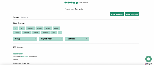
In an era where trust and reputation are paramount, leveraging social proof in the form of testimonials or user-generated content can instill confidence in your product and brand. Integrate customer reviews and ratings prominently on your product pages, allowing potential buyers to glean insights from the experiences of others. Encourage satisfied customers to leave reviews with a post-purchase email sequence and showcase user-generated content to add authenticity and credibility to your offerings.

4. Streamlined Navigation and User Experience
A seamless user experience is fundamental to driving conversions and fostering customer satisfaction. People don’t want to wait for a page to load, or have to put too much effort into finding the right category of products they’re looking for. Minimize the reason to drop off by optimizing your product pages for speed and performance, ensuring fast loading times across devices and browsers. Implement intuitive navigation and layout, with clear categorization and filtering options that empower users to find what they're looking for effortlessly.
5. Elimite Friction Points
On the topic of a streamlined user experience, having elements or pop-ups that require a user to pause their journey and take action can add friction and cause us to lose a potential customer. Reduce any unnecessary steps in the user journey and ensure the process from adding a product to cart to fulfilling the payment is seamless. Use very few steps and avoid sharing any new information (i.e. shipping costs that weren’t stated on the product page) that may prevent the user from completing their order.
6. Mobile Optimization
With 313% more visitors using mobile vs desktop in the past year, optimizing your website and product page for mobile is no longer optional – it’s imperative. Design your product pages with a mobile-first mentality, prioritizing responsive design and intuitive touch interactions. Optimize images and content for smaller screens, and ensure that all elements render seamlessly across various devices and screen sizes. People are impatient, but mobile users are even more impatient with stats showing higher bounce rates and smaller visit durations compared to desktop users. This means that a hassle-free mobile experience is key to maintaining or increasing a strong conversion rate.
7. A/B Testing and Iterative Optimization
Let’s not set and forget. Analyze the performance of your product page, identifying opportunities to conduct A/B tests to evaluate the ideal combination of elements that improves conversion rate. Test hypotheses related to the following:- Imagery (lifestyle vs plain product, image sizes and placement)
- Copy (length and messaging)
- Page layout (order of page elements, including and excluding elements and page length)
- Call-to-Actions (placement, button colour and number of CTA buttons)
Test one element at a time to find the ideal recipe for converting your customers on your product pages.
While there isn’t a perfect template for a product page, being able to implement best practices and identify what converts and engages your audience is key to increasing revenue for your e-commerce store.


